Lieven DE BOECK, Défense d’afficher
Défense d’afficher
An exhibition by Lieven De BOECK for MAISON GREGOIRE
Curated by Wivine de TRAUX and Emmanuel LAMBION
Bn PROJECTS-Maison Grégoire are very pleased to invite you to the exhibition Défense d’afficher, specially conceived by Lieven De BOECK for the space of Maison Grégoire.
This could be the story of a colour which did not exist, blue, the colour of void. The French Michel Pastoureau, who has written an extensive essay on it, underlines that in the antiquity there were no specific words to designate the hue we call blue. In that time, blue (unlike black, red or yellow/gold) was perhaps lacking a strong association with a given symbolic reality, just as there were no corresponding natural pigment easily available for trade. But more essentially maybe, the fact that the elements directly associated by our senses to our perception of blue, i.e. air and water, turn out to be transparent must have played a part in the lexical inexistence of the colour.
Things began to change through contacts with the Celts, who traded a blue pigment (woad) and used it extensively to dye their garments.
This trend gained strength in the Middle Ages, all the more since blue began to be an important colour in heraldry and religion (let one think of the Marian veil) to ultimately be confirmed as one of the main and primary colours, which optical science subsequently proved it to be.
This shift in perception and representation of a given colour gives food to thought, by underlining the supremacy of nominal and symbolic existence on sensorial and physical perception.
In this perspective, the choice of Lieven De Boeck for a blue theme in this show is far from fortuitous. His work is a work which often revolves about ideas of obliteration, disappearance, effacement, with, so far, an important percentage of his works being, quite logically, white.
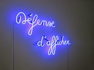
The title of the exhibition, Défense d’afficher (id est no billposting) is the very message conveyed by the blue neon sculpture hung in the dining room. As such, it confronts the viewer with an intrinsic contradiction in terms.
Not far from there, in a corner of the interior, the silent dia projection Image not found quotes the expression which appears on the omnipresent screens of our digital era when the contents of a dvd or of a file cannot be read. The only twist is that here the inscription is set against a natural deep blue background, actually a picture of the sky taken by the artist in Los Angeles, this simple element equally subverting the regular meaning of the signifier.
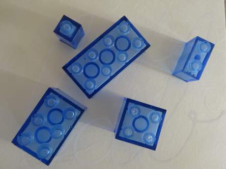
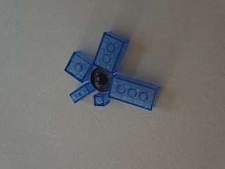
This announcement of the non-apparition of an image or of a content leads us to Série bleue, the small glass bricks which are scattered around the house and are modelled after the well-known Danish playful bricks devised to stimulate children’s imagination.
This recent production, made on the occasion of a residency at CIRVA, Marseilles, brings to the fore, if on a playful and standardised way,
the very idea of construction. In the present case, the inspirational model, that is to say the image, which is normally presented on the cover of the boxes of the actual real games, is absent.
There are five series of five bricks each in different corners of the ground floor. Each series encompasses (in different scales) the distinctive varieties of bricks (1, 2, 4, 6 and 8 pegs) whereas the variation of scales correspond to the first five numbers (1,1,2, 3, 5) of Fibonacci sequence. This famous mathematical series lies behind the golden section, dear to many a humanist and architect, from Leonardo da Vinci until the main exponents of modernist architecture, of which Maison Grégoire is a good example.
Fibonacci lies e.g. also at the base of Le Corbusier’s modulor, the Swiss architect also believing that the harmonious proportions of an architecture should conform to the ideal proportions of the human body as expressed in the golden section.
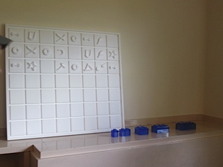
Upon discovering that the playful bricks of the famous Danish firm were also built following these proportions, De Boeck decided to implement the production of his own bricks according to a similar pattern of expansion. Another meaningful and symbolic choice he made was also to have them produced in a material which is in direct contradiction wit their projected use : glass , a material which expresses precariousness, fugacity, and is more associated with the risk of breaking than with the idea of a permanent construction. By doing so, it is as if Lieven De Boeck wanted to underline the utopian character of our aspiration to build and represent the world in an ideal and normative way. This is enhanced by the choice of presentation of the bricks, each of the 4 first series being displayed on prints with background images directly evoking subjective and relative identity signs or symbols (the iris of the artist’s eye, his fingerprint, his signature, a washed-out Belgian flag).
Last but not least, the work called The Blue Story has blue only in its title. These polystirene panels are named after the eponymous texts of Holly Anderson, which are here transcribed/transliterated in Lieven De Boeck’s personal alphabet, modelled and adapted after typologies of spray fonts of New York graffiti.
We just need to take the time to try and decipher these pictures, which, if not vanishing or disappearing, are nevertheless filtered by the subjectivity of an artist who constantly invites us, to reinvent our own norms.
Emmanuel Lambion
Opening on 5 September 2014, 6 30 p.m.
Exhibition open on Saturdays, 2-6 p.m., from 06/09/2014 until 11/10/2014
Maison Grégoire
292 Dieweg
B 1180 Bruxelles
www.maisongregoire.be
emmanuel.lambion@gmail.com